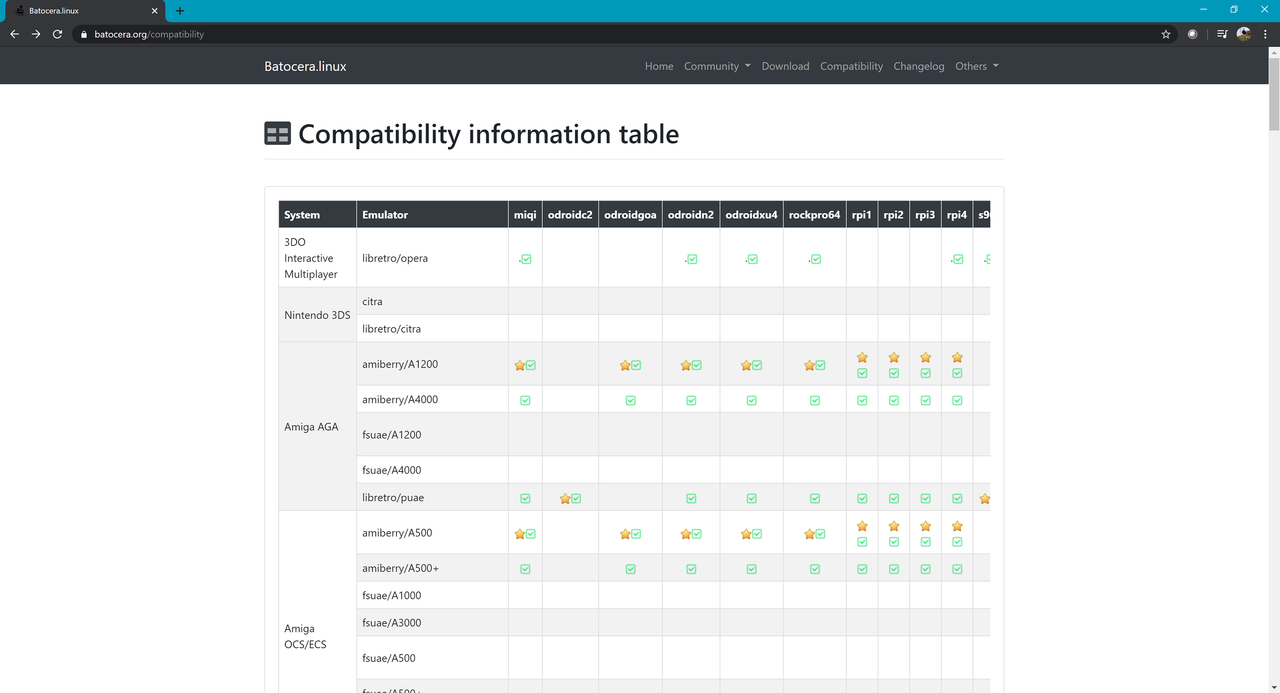
aarkay14 Dear Admins, May I ask you to kindly fix the Compatibility chart display on the web page.. there is so much space available in the page but the chart is shown with a scroll bar and is difficult to navigate even in a 4K display. May I ask you to kindly do the below adjustments: Fix the header of the chart so that it does not scroll with the screen. Make the chart occupy the entire real estate of the screen so that we can see as much as possible and not waste space. You can also make the font 16 bit style so that it looks nice. I am a web developer so if you need any help please do let me know I can make a chart page for you. Kind Regards, Rama
joinski aarkay14 Hi Rama, I agree that the compatibility list could be nicer and i like your idea. Really nice, that you want to help us :) Please come to the discord channel and talk to susan34 in the #developer room. Kind Regards, joinski
aarkay14 Hi Joinski, I am sorry but I could not find susan34 in discord. I am aarkay14 in discord so maybe you can send me a message. Kind Regards, Rama
joinski aarkay14 Hi Rama, i have just asked susan34 in the #developers channel in discord for his opinion ;) Kind Regards, joinski
ordovice Could you take the current compatibility chart html, modify it as you might see it working, and then PM it to me on Discord? Username is ordovice
nadenislamarre i don’t get the point. all the usable space seems to be used to me. by the way, our webmaster is genetick57, you can help him by giving suggestion on the page (this is a basic html page).
ryan86me nadenislamarre There’s loads of horizontal space on both sides of the chart filled with blank white, forcing users to scroll horizontally through the chart instead of having it displayed all at once.
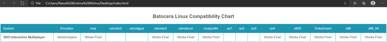
aarkay14 I am sorry for the late reply but I am too old school and searching for people in discord is too much for me! Here you go with the file: https://www.sendspace.com/file/qwse82 It looks like the below: